DESIGN SYSTEM / HP.COM
Scaling design across HP's digital ecosystem
Built reusable foundations that accelerated delivery while improving consistency across HP’s digital products.
Partnered with cross-functional leaders to define components, documentation, responsive patterns, and governance.
Design System • Component Architecture • Interaction Patterns •
Governance • Responsive Design • Accessibility

01 / COMPONENT RESILIENCE
Designing components that perform across every scenario
Together with HP's Creative Director, I helped build a scalable design system that unified components, interaction patterns, and governance across HP.com. Every pattern was stress-tested through responsive layouts, accessibility, localization, dynamic content, and edge cases — ensuring consistency across thousands of real user experiences.
SYSTEM BEHAVIOUR
Clear principles


300+
Components and patterns
25+
Foundational variants
12+
Breakpoints tested
1000+
Content combinations
WCAG 2.2
Accessibility compliant
02 / CONTENT FLEXIBILITY
Designing for unpredictable enterprise content
Designed a flexible card system that gracefully adapts to varying content lengths, media types, metadata, pricing, CTAs, promotional badges, and product specifications: ensuring consistency across commerce, editorial, and marketing experiences without requiring custom layouts.
12+
Content combinations
10+
Card variants
8+
Content hierarchy levels
20+
Optional content slots

04 / NAVIGATION COMPLEXITY
Navigation for enterprise information architecture
Designed to handle deep hierarchies, long labels, multi-step actions, and overflow at every breakpoint.
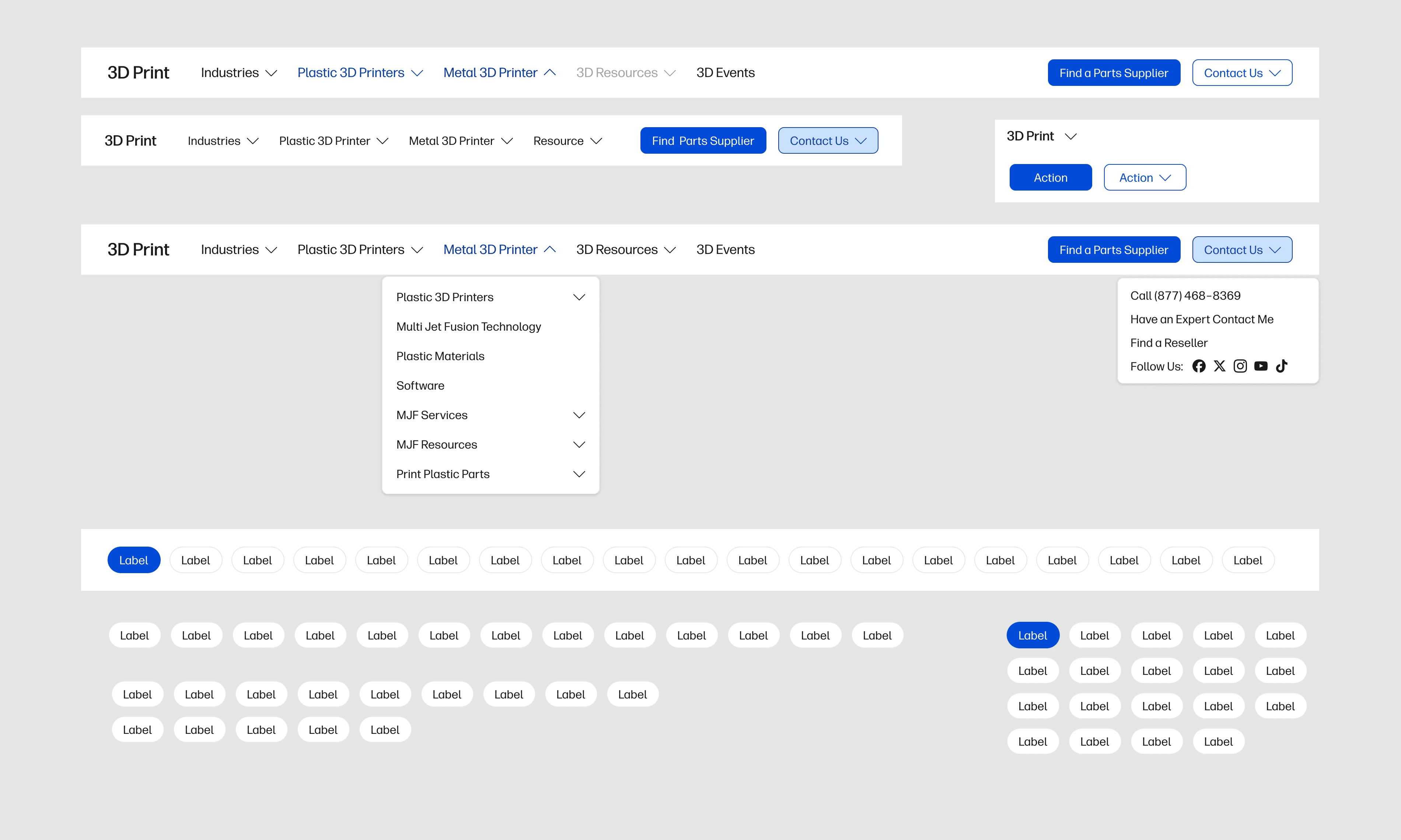
Rather than creating a single navigation, I designed a flexible navigation system supporting multiple HP business units, deep information architecture, responsive behavior, accessibility, and enterprise-scale content structures.
Mega Menu
Structured exploration for deep category systems.
Secondary Navigation
Keeps product families and actions in context.
Mobile Drawer
Prioritised paths for compact, touch-led screens.
Nested Dropdowns
Progressive disclosure for complex hierarchies.
Sticky Navigation
Persistent access to key decisions and actions.
Hover vs Click
Input-aware triggers with intentional behavior.
Keyboard Navigation
Focus order and shortcuts work predictably.
Responsive Collapse
The system contracts without losing meaning.
6
Navigation patterns
30+
Interaction states
AA
Desktop + Tablet + Mobile
03 / RESPONSIVE PATTERNS
Consistency across every breakpoint
Every pattern was designed to preserve hierarchy, usability, and visual consistency across desktop, tablet, and mobile. Responsive behavior was built into the system—not added later—allowing components and layouts to adapt naturally across devices.
Content hierarchy stays intact
Foundational variants
Interactions remain intuitive
Foundational variants
Components scale predictably
Foundational variants
DESKTOP
1440px+
TABLET
768–1024px
MOBILE
320–767px

Designing beyond the happy path
Corner cases are where resilient systems prove their value—before they become product issues.
Content extremes
Long headline
Missing image
Localization
Action stress
Very long CTA
Multiple CTAs
Price hidden
Layout stress
7 filter tags
Mobile overflow
Empty state
Inclusive behaviour
Disabled
RTL
Screen reader labels
03 / COMMERCE PATTERNS
Every pattern started with its corner cases

Rather than designing for ideal layouts, every pattern was validated against corner cases: from extreme content lengths and localization to responsive breakpoints, optional modules, image ratios, and interaction states.
This approach created resilient, reusable patterns that behaved consistently across HP.com's global ecosystem.
50+
Pattern variations
1000+
Layout combinations
OUTCOME
Designing a foundation that scales beyond individual products
The result was a scalable design foundation that enabled product, design, and engineering teams to build faster, stay consistent, and confidently deliver enterprise experiences across HP's digital ecosystem.
FOUNDATION
Scalable components
Reusable foundations with documented states, variants, and accessibility built into every component.
SCALABILITY
Predictable experiences
Responsive patterns behaved consistently across products, breakpoints, and content scenarios.
COLLABORATION
Shared language
A unified system that aligned design, engineering, and product teams around one source of truth.
NEXT PROJECT / 05
From idea to product: building our own startup
DIGITAL WELLNESS STARUP / CO-FOUNDER / PRODUCT STRATEGY