Designing clarity into complex clinical operations
Designing decision-ready workflows for complex clinical research operations and millions of users.
HEALTHCARE AI PLATFORM / PRODUCT STRATEGY / UX LEADERSHIP

PRODUCT CONTEXT
Enterprise payments across complex clinical studies
WORKING MODEL
One team across product, research, and engineering
DELIVERY FOCUS
Clearer task flow, status visibility, and decision confidence
PRODUCT CONTEXT
Connecting roles, workflows, and systems
I led the redesign of a complex clinical payments experience, translating research and product strategy into clearer workflows across multiple user roles.
I mapped the product end to end, connecting user journeys, roles, and dependencies to uncover friction across the existing experience. These insights shaped the transition to the new Design System and guided iterative testing with users throughout the redesign.
User Research
Workflow Design
Design System Migration
Product Improvements
🏗️ Led the Design Process
I mapped key user journeys and roles across the existing product, identifying friction, dependencies, and opportunities for improvement. Working with the design team, I translated these insights into redesigned workflows and progressively migrated the experience to the new Design System.
User testing became part of the design loop, helping us validate decisions and refine the experience before implementation.
👩🏽💻 Led the Team
RESEARCH EVIDENCE
The workflow only makes sense when you see every role in it
Discovery sessions
Direct conversations surfaced real constraints, terminology, and decision points.
Persona mapping
Finance user, system admin, manager, and principal investigator needs were made visible together.
Interaction mapping
The existing reimbursement flow exposed handoffs, uncertainty, and opportunities for a clearer path.
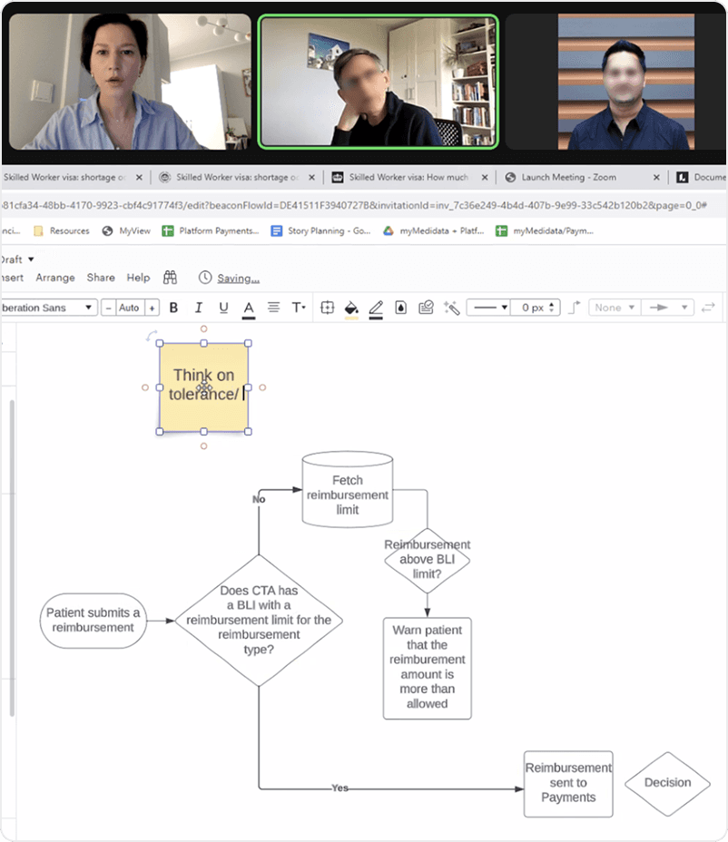
Moderated sessions and reimbursement-flow mapping made the operational edge cases visible.

Persona boards and a cross-role interaction map aligned the team around shared pain points, responsibilities, and opportunities.
WHAT THE EVIDENCE CHANGED
The redesign moved from feature assumptions to an experience shaped by roles, real workflow handoffs, and the moments where confidence matters most.
REDESIGN. BEFORE & AFTER
From dense operations to clearer decision-making

BEFORE · LEGACY STATE. FRAGMENTED PAYMENT VIEW
A dense payment view with key information competing for attention and a less obvious path through the task.
✨ AFTER · INTENTIONAL HIERARCHY. SIMPLIFIED DECISION-MAKING
A more intentional hierarchy and clearer interaction model that makes the next decision easier to find and complete.
New Design System Transition
New Navigation and Table Main component
The new features like Tag Bar, Tree View in Side Panel, Context Viewer, secondary actions inside the table helped Users to navigate and approve/decline Invoices faster, enhancing their overall experience.
New Offcanvas Feature
Offcanvas allows to see Preview of the Item at the same Page in each Table which boosted User’s speed for the main actions.
New Filters and Presets
Unlocked new levels of user engagement with our Product, increased usability metrics to 80% (CSAT).
SR PRODUCT DESIGNER + TEAM
Led the product direction, mapped the workflow, aligned the visual language, and partnered with engineering and research to validate the experience.
DESIGN SYSTEM: DESIGN TOKENS &
COMPONENT ANATOMY
A system that helps clinical work stay coherent
I translated recurring clinical workflows into durable building blocks — so teams could design faster without losing clarity, accessibility, or product context.
01 / Reusable component anatomy
02 / Shared tokens and states
03 / Consistent clinical workflows


MOBILE
Mobile version for ClinOps
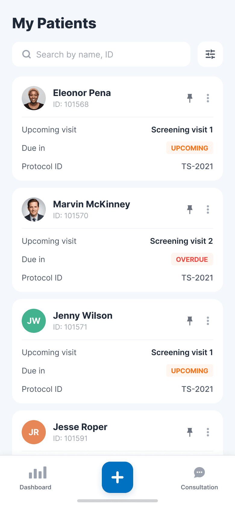
The mobile experience was designed around the needs of Clinical Operations teams in the field—giving them quick access to patient context, daily tasks, visit management, and signals that require attention. Rather than replicating the desktop experience, we focused on what users needed to understand and act on in the moment.
MOBILE PRODUCT STRATEGY
From scattered signals to action in the moment
MOBILE FOCUS
Patient context, daily tasks, and timely follow-up—without the desktop complexity.
PATIENT CONTEXT — see the full story, fast
VISIT MANAGEMENT — keep tasks moving
SIGNAL REVIEW — identify what needs attention



NEXT PROJECT / 03
WEB3 EXPERIENCE | CREATOR ECONOMY
BLOCKCHAIN PLATFORM AND MARKETPLACE